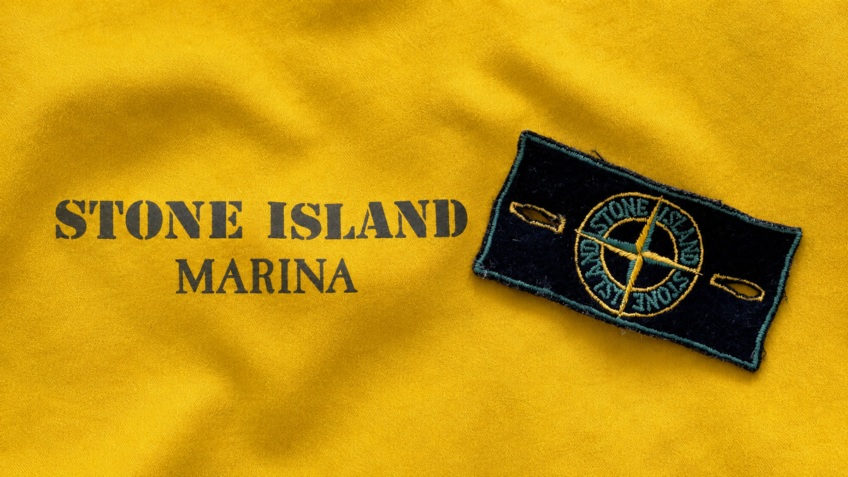
The Stone Island Logo Through the Eras
Few logos are as instantly recognisable as Stone Island's. Yet behind its apparent stability, the brand's emblem tells a whole story: that of a symbol that has stayed true to itself since 1982, while taking on new forms across the lines and collections. A short journey through time around the ultimate cult logo of technical clothing.
1982: an emblem born with the brand

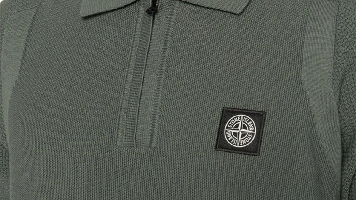
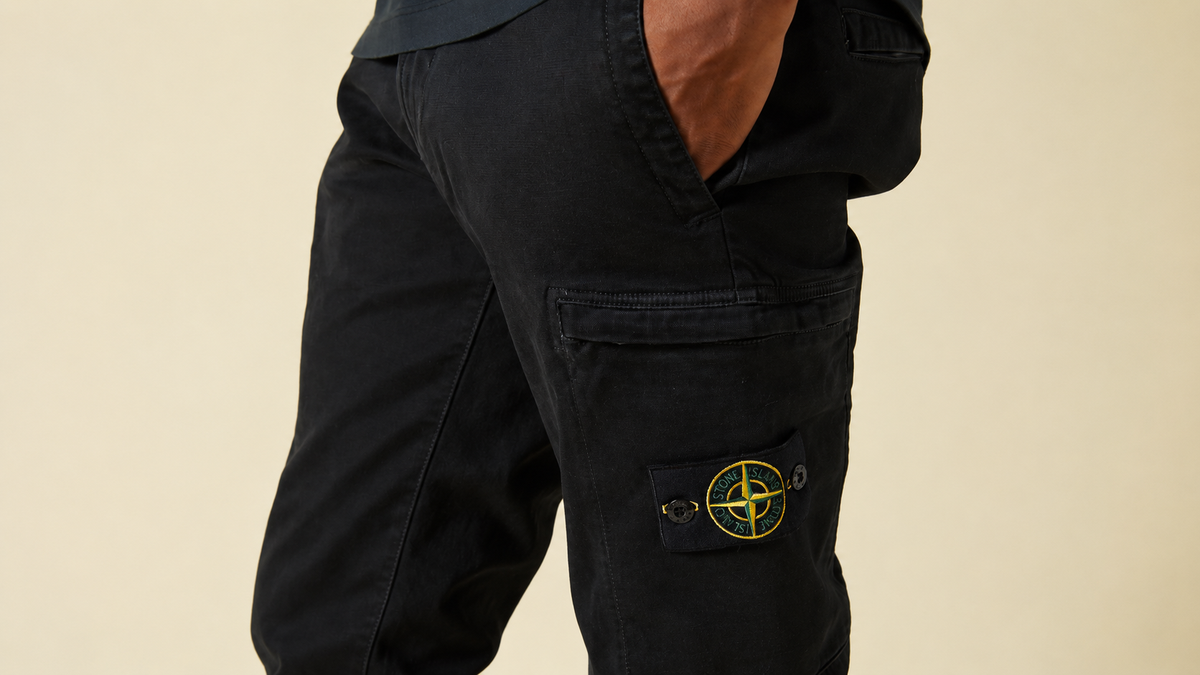
From its creation by Massimo Osti in 1982, Stone Island adopted its famous compass rose badge, sewn on the left sleeve. The idea was a powerful one: to associate every garment with the maritime world and exploration. To understand everything this symbol represents, you can read our dedicated article on the Stone Island compass badge.
To place this emblem within the brand's overall journey, our article on the history of Stone Island traces the key milestones, from Massimo Osti to the Moncler group.
A logo of remarkable consistency
Unlike many brands that regularly modernise their visual identity, Stone Island has made the opposite choice: keeping its badge virtually unchanged over the decades. This consistency is not a lack of daring but a genuine strategy. The badge has become a reference point, almost a seal, that connoisseurs recognise at first glance. It is also what makes it a timeless symbol, riding out the trends without ever going out of fashion.
The same logo, many faces across the lines

While the emblem remains the same, its treatment varies across the brand's different worlds. This is where the logo really travels from one era and one collection to the next:
- The classic line: the yellow and black badge, in its best-known version, on the brand's iconic pieces.
- The Ghost Piece: an approach based on discretion, where both the garment and the badge are treated tone-on-tone, the logo blending into the fabric for a minimalist result.
- The Marina line: a nod to the brand's nautical heritage, with graphic codes inspired by the maritime world.
- The Shadow Project: Stone Island's most technical side, developed with the designer Errolson Hugh (ACRONYM), which adopts its own insignia and markings.
These technical variations extend the house's spirit of research, which we explore in our article on Stone Island's technical pieces.
Special editions and anniversary badges
Over the years, the brand has produced numerous special series and limited editions, sometimes accompanied by reworked badges or new colours. Highly sought after by collectors, these pieces show how the same emblem can occasionally reinvent itself without ever losing its identity.
The badge, a guide to dating and authenticating a piece
Because it has changed little but has been adapted in many ways, the badge is an excellent clue for placing a piece and checking its authenticity. The colour, finish, embroidery and type of fastening help to identify the line and spot a possible counterfeit. It is one of the key points of the authentication process applied to every piece at NB08.
Frequently asked questions
Has the Stone Island logo changed since 1982?
In broad terms, no: the compass rose badge has remained very close to its original version. It is mainly the variations by line (Ghost, Marina, Shadow Project…) that bring variety.
Why are there several Stone Island badges?
Because the brand develops different lines, from the most classic to the most technical. Each adopts its own treatment of the logo, while retaining the spirit of the emblem.
Does the colour of the badge have a meaning?
It most often corresponds to a particular line or series. It is a useful element for identifying the piece and placing it within the brand's world.
Discover Stone Island at NB08
Explore our full Stone Island selection, both new and authenticated pre-owned, and spot the badge on our jackets and sweatshirts.